This text is intended as an introduction to electronic navigational charts (ENCs). It covers how they are designed. This knowledge helps understanding how to use them and their limitations. It is an essential reading before using our introduction to electronic navigation applications. You can also read a similar text on the Canadian Hydrographic Service website.
Paper charts are disappearing. Electronic charts and applications are considered acceptable in several countries, but Canadian regulations still require paper charts to be carried onboard. There are exceptions, but for boaters exploring new places, it is an obligation. There are no reason not to hope for change, or not to use your favourite electronic navigation application, but to comply with the regulations, you have to have paper charts on board!
Summary of differences
If you don’t feel like reading the whole text, this little table summarises the differences between the different types of chart.
| Paper chart | Raster chart | Vector chart | |
| Electronic? | No | Yes | Yes |
| Main characteristic | It is an image printed on paper. | It is an image displayed on a screen. | It is a computer database whose display changes according to the context. |
| Format | Paper. | Any image format (jpg, png, etc.) | S57, S100 and others. |
| What happens if you zoom in with your electronic application? | N/A | The map will become blurred (pixellated). No new object will appear. | The map still appears sharp. Some objects will appear. |
| Can I change what is displayed? | No. | No. | Yes, depending on the options offered by your electronic application. |
Raster charts
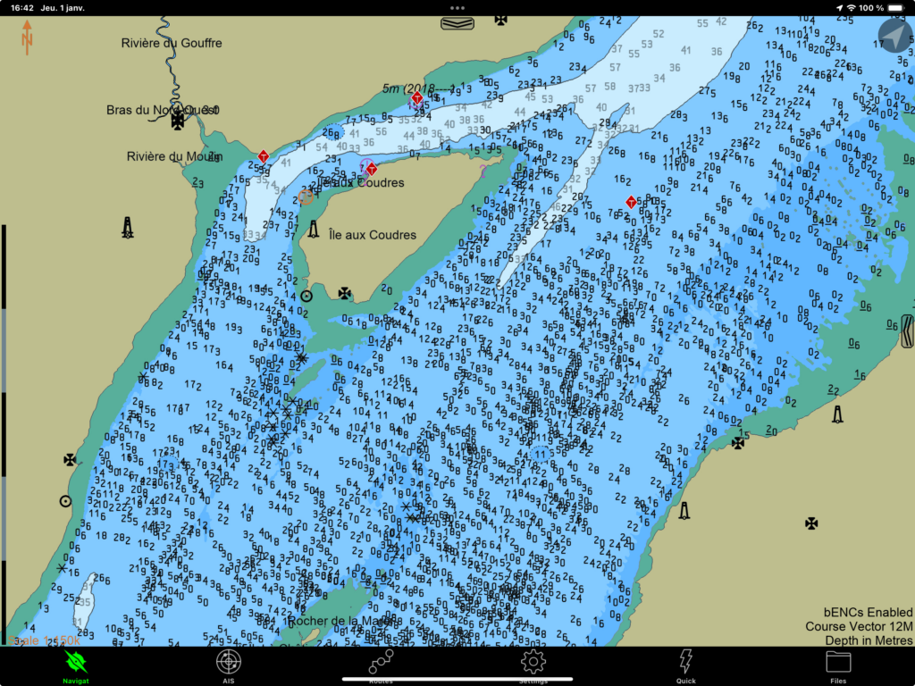
Raster charts are high-definition images of charts. They are images. Originally, electronic charts were scans of paper charts. Raster charts were later refined by printing the computer file directly onto a digital image format.
Apart from the fact that they can be displayed on screen, they are in principle identical to paper charts. Like digitised photos or drawings, they are still images, meaning that the navigation symbols remain no matter how far you zoom in on the screen. For example, buoys and bathymetry information have been carefully displayed to maximise clarity, safety and legibility. The display is fixed and is a choice that is made when the chart is designed.
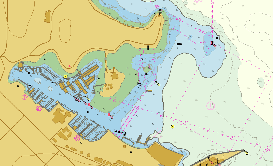
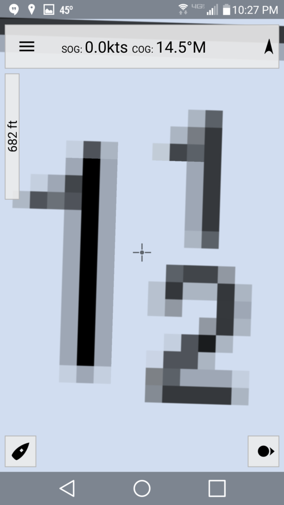
From your electronic navigation application, you can test whether you are working with a raster chart by zooming in excessively. With a raster chart, the screen resolution will eventually exceed the image resolution and the chart will look pixelated (see images below).
Some American charts are in raster format. Some Caribbean countries also have charts in raster format. However, these formats are primarily a model for the transition from paper to electronics. Eventually, they will be all replaced by vector charts.
Vector charts
Vector charts are radically different objets. They are not images, but databases. These data represent either the geographical aspects of the chart (tidal flats, land, water, etc.), or navigation symbols (buoy symbols, etc.). These data symbols are coded in the form of mathematical formulae. Each time a navigation application needs to display a symbol, the computer calculates the drawing to be displayed at the appropriate size, and then rendered on screen.
Vector charts are therefore dynamic objects that can be used to modify what is displayed. For example, when the chart is enlarged on the screen, a navigation symbol (e.g. a buoy) or a depth contour will retain a similar size. Drawings are redrawn according to size. In this way, there is no pixelation and no loss of resolution.
Advantages and disadvantages
False precision
Redrawing the symbols according to the scale of the map is an advantage in terms of legibility: the screen will always display a legible chart. However, there is a risk: the chart will not necessarily be more accurate: it simply redraws the data it holds.
This characteristic is therefore an inherent danger in navigation: zooming in on a region of the chart may show a given isobath, but the line is the result of a calculation. So beware of excessive zooming: although the chart is always sharply drawn, it does not necessarily reflect such precise information. In reality, an isobath may be slightly offset from the calculated drawing.
Display varies with scale
Vector charts also have another important difference from paper or raster charts: the symbols displayed on a vector chart are drawn according to the parameters of your electronic navigation application. It is your application that decides whether a symbol is displayed or not.
I illustrate two examples below. The first example shows the equivalent of chart #1233 at low resolution and at a slightly higher resolution. In the low resolution screenshot, the electronic navigation application (here SEAiq) does not display the water depth at chart datum. The following image shows, however, that by zooming in a little, the depths do appear.
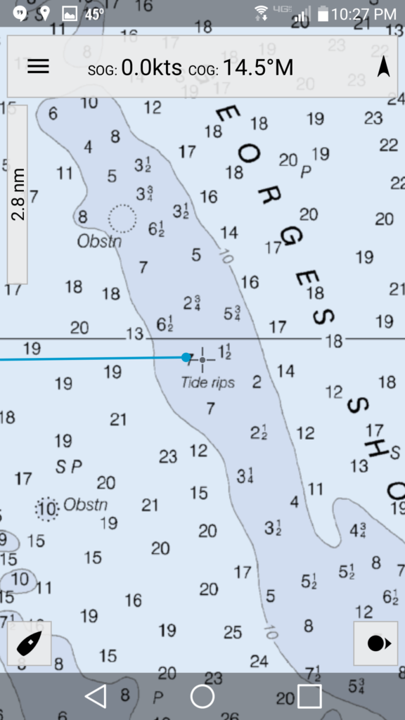
I’ll show a second example, this time using the Navionics (Boating) electronic application. The map shows Port meunier, south-west of Anticosti Island. The scale in each image is respectively 3 nautical miles, 1 nautical mile and half a nautical mile respectively. As the resolution increases (by zooming in), the symbols for range lights, buoys, rocks and depths appear in succession.
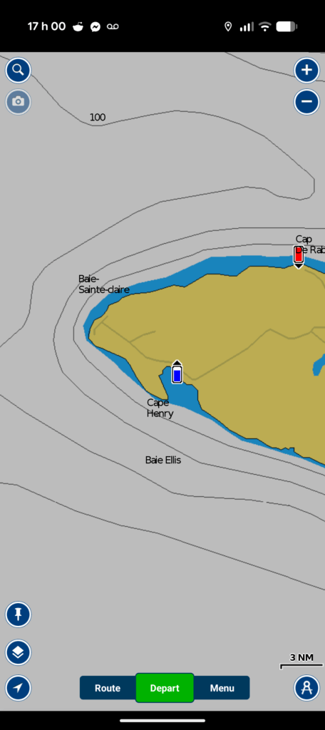
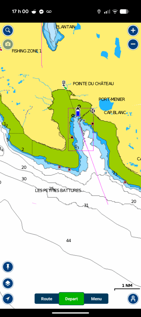
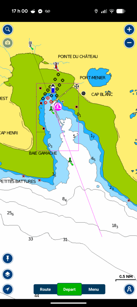
To extract all the information from the chart, it is a good practice to zoom in to see whether or not new symbols appear. Once you have scanned the charts to identify the symbols, it is good pratice to return to an appropriate zoom, so as to avoid the problem of false precision.
The S57 and S100 formats
Vector charts come in two formats. The current format complies with the International Hydrographic Service‘s S57 standard. The new chart format is called S100 and is gradually becoming available to the general public. In the United States, some S100 charts are already available, while in Canada, deployment is scheduled for 2026, as of December 2025.
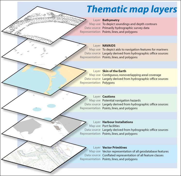
The S57 and S100 formats organise data in logical groups, often called layers: the geographic layer, the bathymetric layer, the currents layer, the navigation symbols layer, and so on. The idea of layers is similar to that of photo editing software. These layers can be displayed or removed, depending on the options in your electronic navigation application.
The two main additions to the S100 maps are the ability to process encrypted data and to process dynamic data. The first is useful for protecting proprietary data or state secrets (e.g. military charts). The second addition enables charts to be generated with real-time data. For example, you can display currents in real time. In Canada, the St. Lawrence Global Observatory is the pilot organisation experimenting with the new S100 format.
How to decode symbols on a chart?
Electronic navigation applications offer ways of interpreting the symbols displayed on a chart. These methods vary from one application to another. Sometimes a crosshair is moved over the object, sometimes a simple click is made on the object, but in general, some sort of interaction tells the app to reveal the signification of a symbol.
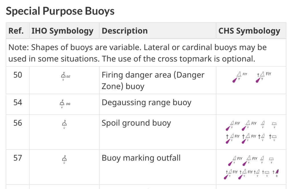
That said, all symbols displayed on a navigation chart are recorded in a master document of the Canadian Hydrographic Service: chart #1. By selecting a section of the document, you can understand the meaning of any symbol on Canadian charts. Below, an extract from chart #1 shows how to interpret the symbols for certain special buoys.


10 Responses
[…] Navvy est une application permettant d’afficher des cartes électroniques. Elle est disponible sur les appareils android et […]
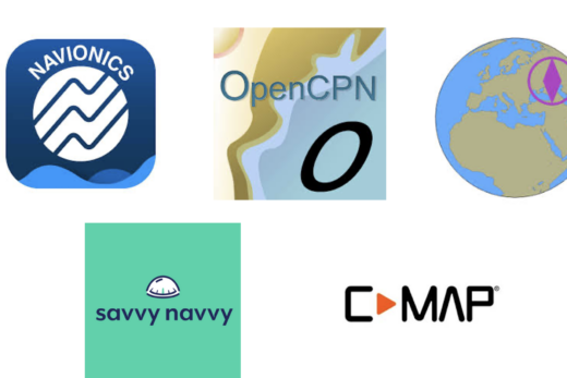
[…] navigation applications for small craft. These electronic applications are used to display electronic charts. For concrete examples, this site includes five introductions to different applications: Navionics […]
[…] Savyy Navy, C-MAP and SEAIQ respectively. Prior to reading this text, it is a good idea to reat the introduction to electronic charts and the introduction to electronic navigation applications. Both will help understand this […]
[…] as it applies to all navigation applications. It is also a good idea to understand the text on electronic chart formats. It should also be noted that this is not a text explaining how to make a navigation plan, but […]
[…] you haven’t already done so, it is a good idea to read the text explaining electronic chart formats. It is also a good idea to read the text about general features of navigation apps. Both are […]
[…] phone. In this respect, the Introduction to electronic navigation applications text, as well as the Introduction to electronic charts text, are good prior reading. They cover elements common to all navigation applications installed […]
[…] SEAiq integrates several services into a single subscription. It displays maritime traffic in real time, and allows you to view currents, winds, tides, navigational warnings and bathymetry in much greater detail than a conventional navigation application. It is also designed to be connected directly to pilots’ own portable instruments and includes an anchorwatch mode. The added value of SEAiq is thus the integration of otherwise disparate information, and its integration within a single screen. As far as I’m concerned, I find the application attractive because it is able to interpret and display the new S-100 chart format. […]
[…] Introduction to electronic chartsWhich Navigation App is Best for Me? […]
[…] Introduction to electronic chartsWhich Navigation App is Best for Me? […]
[…] St. Lawrence Global Observatory had been offering limited access to various S-100 map layers for some time. At the end of March, they launched the Nautilo app. This extends these maps […]